

 Cameron Moll is a designer, speaker, and author living in Sarasota, Florida (United States) with his wife and five sons. He's the founder of
Visual Hierarchy is the Art of Managing, Not Eliminating
published 29 April 2010
A few months ago 37signals redesigned Basecamp’s notification emails, and the result was a move from plain-text emails to HTML emails. For reference, these emails are sent when someone posts or replies to any of the content types in the system (messages, to-dos, etc).
I’m generally opposed to receiving HTML emails if a plain-text alternate is available. I use email as a tool to send and receive communication, and too often some creators of HTML email offer visual noise more than anything else. Ironically, they fail to leverage one advantage HTML email has over plain-text email: visual hierarchy, or the ability to help the reader get the right message using color, proportion, and so forth.
Visual hierarchy, the classification of elements according to importance and relationship to other elements, tends to be one of the most ignored and underutilized principles of design. Perhaps this is because it’s difficult to talk about hierarchy exclusively without mentioning other design principles—proportion, proximity, position, alignment, contrast, relativity, dominance, and color. Managing all this stuff can be overwhelming.
But that’s just it. If there’s one thing I’ve learned over the years about visual hierarchy, it’s this: Great hierarchy isn’t always achieved by eliminating complexity, but by managing it.
Returning to Basecamp, allow me to use its emails as a reference for managing complexity. Here’s what an email from Basecamp looks like:
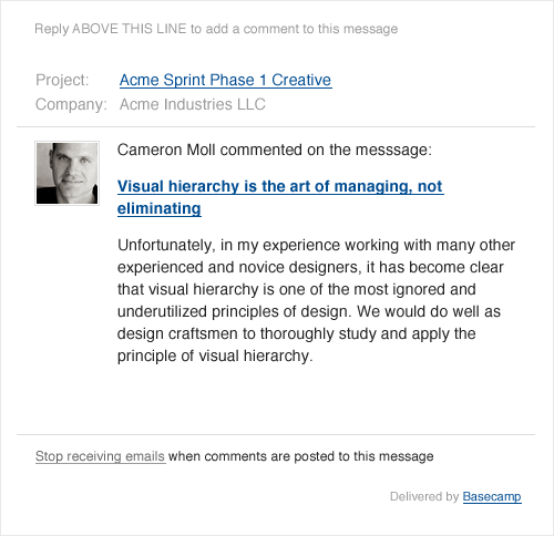
While these emails are certainly better designed and less cluttered than most HTML emails I receive, I still think there’s room for improvement.
Let’s say we kept all of the elements you see above, but managed them differently according to proportion, proximity, contrast, etc. Perhaps it would look something like the following:
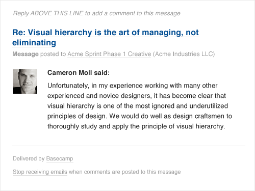
Notice some of the lines around the content have been removed, text sizes differ, and contrast has been increased. In particular, emphasis has been placed on (arguably) the two most important parts of this email: who said what, and to what were they replying. The design isn’t radically different, but it doesn’t always need to be. Sometimes small things make a big difference.
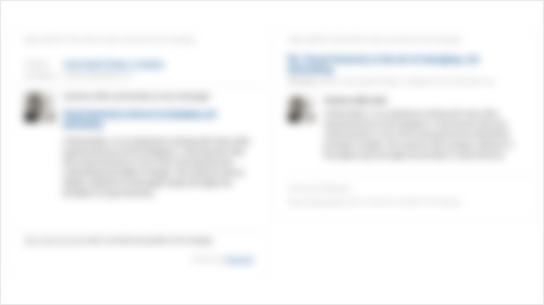
Finally, if we blur the two designs and put them side by side, the difference in emphasis between the two should be even more apparent.*
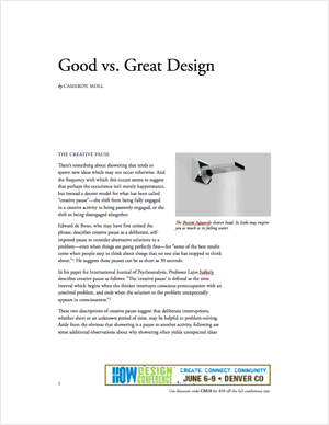
If this topic interests you, come see me speak at the HOW Design Conference this June in Denver, Colorado. They’ve allowed me to post a brief summary of my upcoming session, “Good vs. Great Design”, in which I’ll talk about visual hierarchy and much more. You can download a copy of this summary in PDF format.
Remember, you needn’t eliminate things to improve visual hierarchy. Sometimes you just need to manage everything a little better. It’s not that difficult with a little practice.
* Of course, I’ve not yet enabled comments on this Tumblr-powered site, so you have no way of disagreeing with me on the redesign. I’ll take your silence as agreement. I’m kidding. Tweet me (@cameronmoll) your thoughts.
fluffynteddy liked this
24-volt-solar-battery-charger liked this
houston-florist-delivery-blog liked this
learnlanguagequick liked this
arabicbride liked this
samsungalaxynote3 liked this
beachesresortshotels-blog liked this
damenleeturks liked this
bestshoeforyou-blog liked this
psedecals-blog liked this
zawadio-blog liked this
zoblue liked this
cameronmoll posted this
- Show more notes